Insights


In Part 2 of our series, we introduced a way of looking at times (flow events) when accurate forecasts (forecast events) can help us make good decisions. It is likely that this will only happen a few times each year, so we are now faced with little information to assess, which is what we will address in Part 3.
How can we evaluate how well the forecast events predicted the flow events? Computing the performance statistics would be one way. But how well can statistics represent actual long-term performance if we only have a few flow and forecast events to assess? To help, we can identify indicators that characterize a good forecast. These include
- The forecasted flow hydrograph follows the observed flows
- It predicted the time of crossing Action Thresholds
- The threshold crossing was predicted early enough to be useful
- The forecasts within a forecast event look similar – they do not oscillate between high-forecasted and low-forecasted flows
The first two items really look at individual forecasts, while the third examines how far in advance we predicted an event would occur. The last item is more about consistency—are the forecasts predicting similar events from one forecast the next?
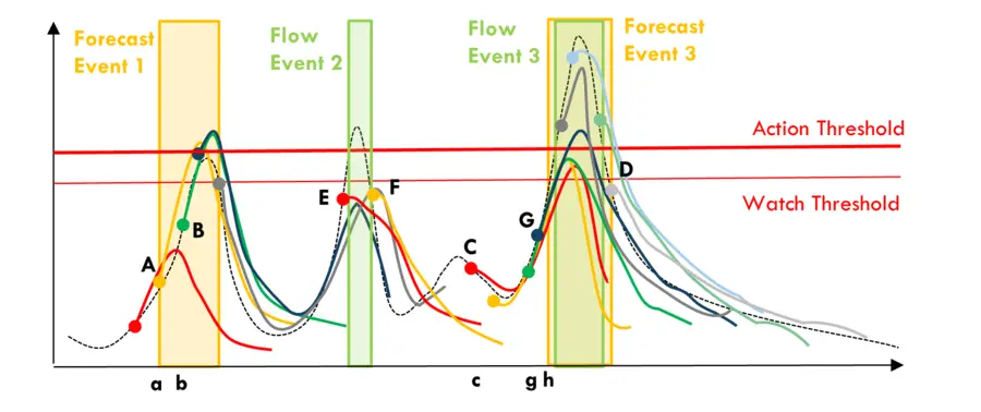
To help explain, let’s look at the images below. Just by glancing at the first two events in Figure 1, we can tell that forecast event 1 warned that flows would exceed the 'Watch Threshold' and the 'Action Threshold.' The actual flows never reached this level so we might have started some actions that were ultimately not needed. But they were close, and we were safe rather than sorry. The fact that, as the event was unfolding, the observed data were lining up with the forecasts (i.e., the early portion of forecast A and B) gave us greater confidence to believe the forecasts. On an alignment range from zero (no alignment) to one (great alignment), with an alignment of 0.5 demarking where the forecast become useful to us, we may subjectively give it a 0.7.
In the case of flow event 2, where the forecasts did not prompt us to start watching the situation, but the actual flow exceeded the threshold. We missed the flow events, and an alignment of zero could be appropriate.
Flow event 3 was predicted much better. We knew at time C that we had to watch the situation and learned at time G that the 'Action Threshold' would be crossed. This was useful because the forecasts were consistently forecasting large flows that actually happened. Give it an alignment score of 0.9.
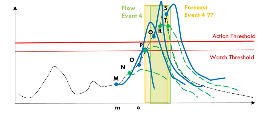
In the second figure, we are warned of high flows early. But during the event, the forecasts oscillate between rising flows (thick blue lines) and falling flows (dashed green lines). Which ones should we believe? We would have had less confidence in these forecasts and hence could give it an alignment score of 0.4.
Subjectively scoring forecast alignment in this way takes manual examination and time, particularly if there are many locations of interest, but there are not many flow and forecast events in one year. Plus, we can score the alignment as we go after each event has passed. In the end we will end up with a set of alignment scores, 0.7, 0.0, 0.9, and 0.4 in our example.
We will explore what to do with these numbers in Part 4 of our series.
If you missed it, be sure to go back and read Part 1 and Part 2 in this series.
Disclaimer: This piece was written by Michael Thiemann (Senior Water Resources Engineer and Data Systems Architect) and Katie van Werkhoven (Senior Water Resources Scientist) to share perspectives on a topic of interest. Expression of opinions within are those of the author or authors.