Using data visualization to inform decisions about buying and selling local foods
North Carolina is among the top 10 states in agricultural production. In 2015, more than 2,000 farms covering 912,000 acres yielded more than $2 billion by growing and selling soybeans, corn, sweet potatoes, and other crops.
Though North Carolina is an agricultural powerhouse, many farmers and policymakers sought to understand where local foods were selling in the state and who was buying them—critical information for identifying where items should be sold to turn a profit and where improvements to “buying local” were needed.
To help local farmers, consumers, businesses, and decision-makers answer these questions and better understand how communities in North Carolina buy local foods, our team developed a series of three easy-to-use online dashboards in partnership with the NC 10% Campaign—a collaborative statewide initiative that encourages business and individuals to commit 10 percent of their existing food budget to locally raised, caught, and produced foods.
As a leader in collecting, analyzing, and leveraging data, we sought and incorporated feedback from stakeholders to ensure the dashboards provided the information they needed, and used data visualization—the presentation of data as a picture or graph—to make sure they could easily and effectively grasp the information.
Developing Interactive Dashboards through User-Centered Design
We followed a design process that considers the needs of the end user at every stage of development. Because the dashboards needed to be turned around quickly and with a modest budget, this process provided critical guidance, development philosophy, and efficiencies that drove positive results in the end.
Despite being a technology-heavy project, the initial brainstorming meeting with the NC 10% Campaign did not involve computers at all. We discussed who the end users of a dashboard were and what questions or problems they might have that we could answer. Generating these thoughts and ideas led naturally into developing initial sketches of the dashboard.
After the brainstorming, we understood that the data needed to be customizable and consumable by diverse audiences. We developed three dashboards that provided information on where North Carolinians were buying local foods, how much they were buying, and how much North Carolina businesses were spending on local foods. Each dashboard is customizable by county.
The final versions of the dashboards were presented at two agriculture conferences: The Cooperative Extension Conference of North Carolina and the Sustainable Agriculture Conference. These presentations allowed for field testing among subject matter experts and generated ideas for future iterations and additional possibilities in data visualization.
Putting the Dashboards to Use for North Carolina Farmers and Consumers
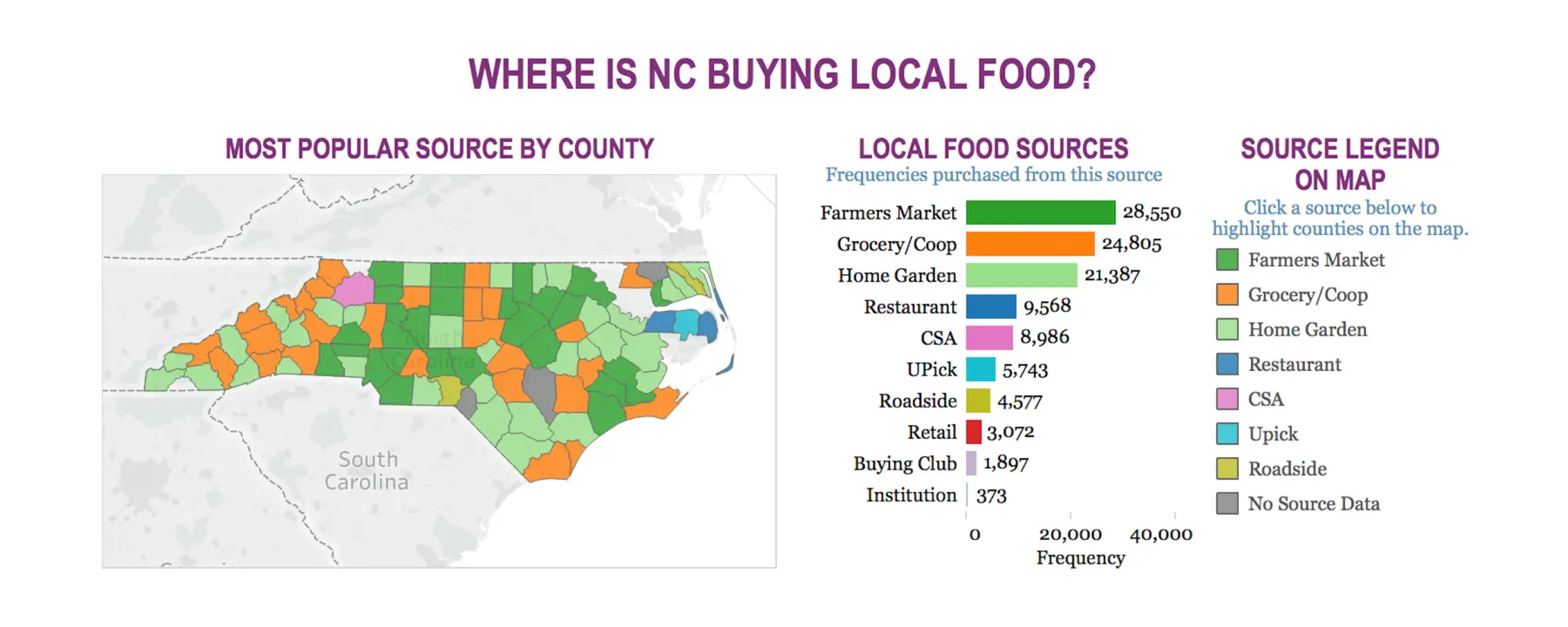
Data for the dashboards were collected from NC 10% Campaign’s 10,000 members and business partners who voluntarily reported their local food spending over 5 years. From these data, we found that, on average, members spend $30 per month on local foods, and most buy from farmer’s markets. We also found that Wake County spends the most on local foods, with about $700,000 spent between 2010 and 2015.
The dashboards are now publicly available on the NC 10% Campaign website. With this easy-to-understand information, farmers, consumers, business, and decision-makers can better understand the demand for local foods across the state and identify areas for support. Using the dashboards, farmers are able to identify which sources—farmer’s markets, roadside stands, or grocery stores—are most popular in their community and adjust their selling locations accordingly. Consumers can compare their spending to others in their community, while policymakers are able to leverage the dashboards to inform decisions about local food and improve spending.
- NC 10% Campaign
- North Carolina State University

